Catalog photography is a discipline with rules. Not arbitrary ones — rules that exist because brands learned, expensively, what actually converts browsers into buyers.
The problem in 2026? Following those rules the traditional way requires a full crew, a booked studio, and a production budget that scales with every SKU you add. And you still don't get the consistency you need.
This guide covers what best-practice catalog photography actually looks like, the most common mistakes brands keep making, and how AI has quietly begun delivering professional-grade results at a fraction of the cost.
What "Catalog Photography" Actually Means
Catalog photography is product-led, not story-led. Unlike editorial photography — which sells a mood — catalog photography sells the item. Shoppers need to see:
- The actual color of the garment (not styled under dramatic lighting)
- How it fits on a body (proportions, drape, silhouette)
- Enough detail to make a purchase decision without seeing it in person
This distinction matters because catalog and editorial require fundamentally different setups. Many brands confuse the two and end up with images that look beautiful but don't convert.
The Core Standards of Fashion Catalog Photography
1. Lighting
Consistent, flat, and true-to-color lighting is the foundation.
The standard setup:
- Softboxes or a light tent to diffuse shadows
- Color temperature around 5500K (daylight-balanced) for accurate fabric rendering
- Fill light at roughly equal intensity to the key light — you want minimal shadow, not dramatic ones
- No colored gels unless specifically required by the brand's visual identity
The single most common lighting mistake: using a single key light without adequate fill. It creates shadow on one side of the garment that distorts the perceived shape and color. Shoppers notice even if they can't name why.
Consistency across a shoot is equally critical. If your first 50 SKUs were shot at noon with window light and the next 50 under studio strobes, your catalog will look like it came from two different brands.
2. Camera Angles
Fashion catalog photography has standardized around a small set of angles that work. Deviating without good reason usually just confuses shoppers.
Standard angles by product type:
| Product | Primary Angle | Secondary Angle |
|---|---|---|
| Tops, dresses, outerwear | Front straight-on, mid-shot | Back shot, 3/4 turn |
| Bottoms (trousers, skirts) | Front mid-shot, full length | Back, detail shot of waistband/hem |
| Footwear | 3/4 angle at eye level | Side profile, sole detail |
| Accessories | Flat-lay or 45° table shot | On-body context shot |
For on-model shots, the camera should typically be at chest height for torso-focused items and hip height for full-length shots. Eye-level feels natural and avoids the distortion of shooting up or down.
3. Backgrounds
The most debated decision in catalog photography: what goes behind the product?
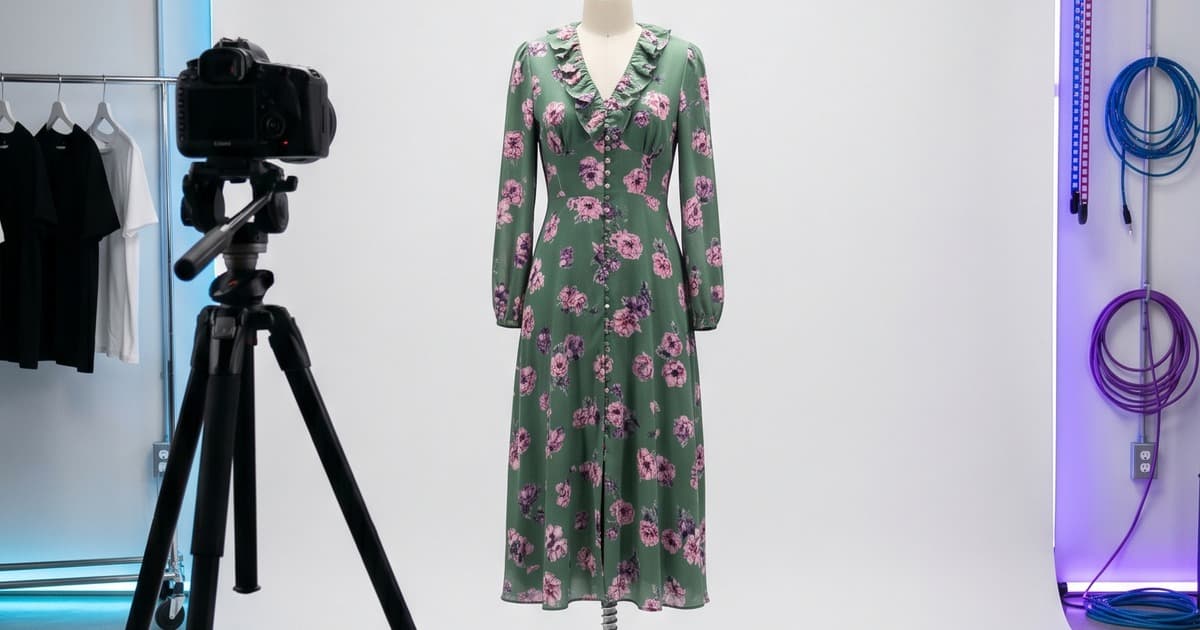
White background: The industry default for a reason. It isolates the product, photographs consistently, and integrates cleanly into any website design. Most major ecommerce platforms are visually built around white-background images.
- Best for: PDPs (product detail pages), B2B line sheets, wholesale catalogs
- Pros: clean, versatile, no distraction
- Cons: can feel clinical; doesn't convey brand personality
Lifestyle background: Real-world context that places the garment in a believable setting — a city street, a home interior, a café.
- Best for: lookbooks, campaign imagery, social content, editorial carousels
- Pros: emotional resonance, aspirational appeal
- Cons: consistency is harder; more expensive per shot; backgrounds date faster
Editorial/colored backdrop: Solid non-white color, studio paper, or textured backdrops.
- Best for: seasonal campaigns, brands with strong visual identity, fashion-forward positioning
- Pros: distinctive, can differentiate from competitor catalogs
- Cons: limits flexibility across channels; less "shoppable"
For most fashion brands, the answer is both: white-background for PDPs and catalog pages, lifestyle for lookbook and social. Trying to do everything with one background type is a compromise that serves neither purpose well.
4. Model Consistency
This is where most catalog shoots quietly fall apart.
Consistency across all images in a catalog requires:
- Same model (or models with similar proportions)
- Same model stance and posing direction across equivalent product types
- Same hair and makeup look across the shoot day
- Same model-to-camera distance for each product category
Even small inconsistencies — model changed her hair mid-shoot, different shoe heel height affecting posture — create a visual disconnect that makes your catalog feel unpolished.
5. Post-Production Standards
Retouching for catalog photography should be invisible and corrective, not transformative.
- Color correct to match the physical garment (fabrics shift under studio lighting — this is standard, not optional)
- Remove distracting wrinkles or lint — but preserve the natural drape of the fabric
- Consistent crop and padding across all images in a category
- Export at a consistent resolution (typically 2000px on the long side for digital, 300dpi for print)
What to avoid: over-smoothing, liquifying, or dramatically altering the garment's appearance. Shoppers who receive an item that looks different from the catalog photo return it. High-quality returns are expensive.
The 5 Most Common Catalog Photography Mistakes
1. Inconsistent lighting across a multi-day shoot
Day one was overcast, so you supplemented with a strobe at 5500K. Day two was sunny, so you relied on window light. Your catalog now has 200 images in subtly different color temperatures. Nobody will complain about any individual image — but the catalog feels "off."
Fix: standardize lighting entirely, or don't mix shooting days without resetting to a fixed reference.
2. Skipping back shots
Shoppers buying garments online are buying without touch. They want to see everything. Skipping the back shot on coats, dresses, and trousers is a conversion killer.
Fix: build back shots and detail shots into every SKU's shot list — not just the hero items.
3. Forcing one background type across all content types
White background images used in lifestyle editorial campaigns look out of place. Lifestyle images used on PDPs create visual inconsistency across your product grid. These serve different purposes.
Fix: plan catalog shoots to produce both white-background and lifestyle variants simultaneously.
4. Over-retouching to the point of misrepresentation
Some brands (especially in activewear and denim) over-retouch to the point where the product looks like a different item. Returns spike. Reviews mention "not as pictured."
Fix: set an internal policy — retouching is for technical corrections, not product upgrades.
5. Not shooting enough variation per SKU
A single hero shot per SKU is not enough for a modern fashion ecommerce page. Most high-performing PDP pages have 4–7 images per product: hero, back, detail shot, on-model lifestyle, flat-lay.
Fix: build multi-shot shot lists into the production plan from the start — and budget accordingly.
How AI Catalog Photography Handles These Standards Automatically
The standards above aren't hard to understand. They're hard to consistently execute across a full collection of 100+ SKUs across multiple shoots spread over a season.
That's where AI-generated catalog photography changes the equation.
Lighting is always consistent
AI generation applies the same lighting logic to every garment you process. There's no "overcast day two" problem. Every SKU is rendered under consistent studio conditions. The 300th image in your catalog looks identical in lighting quality to the first.
Background types are a setting, not a production decision
Want white background for your PDPs and lifestyle for your lookbook pages? With AI, you select both — and both are generated from the same product upload. You don't have to schedule a separate shoot or hire a different location. Learn more about building full lookbooks with AI here.
Model consistency is a default, not an achievement
You select an AI model — and that model appears across your entire collection with the same proportions, posture baseline, and visual styling. There's no mid-shoot hair change, no different stylist on day two, no model cancellation that forces a reshoot with a different person. See how AI replaces the traditional shooting day entirely.
Scale without additional cost
The cost structure of traditional catalog photography is roughly linear with SKU count. More products = more shoot days = more budget. AI catalog generation doesn't work like that. Processing 50 SKUs versus 500 SKUs doesn't require proportionally more time or budget — the per-unit cost drops significantly at scale.
For brands with growing product lines, this is a fundamental shift in how catalog production is planned and budgeted.
Color accuracy through AI calibration
Modern AI catalog tools are calibrated to render fabric colors accurately from uploaded reference images. The risk of color shift — a real problem in traditional photography, where fabrics photograph differently under studio light — is handled in the generation process rather than in post-production.
When to Use Traditional Catalog Photography vs. AI
This isn't a binary question. For most growing fashion brands, the answer is a hybrid approach:
Traditional photography makes sense when:
- You need very high-touch editorial imagery for a brand campaign
- You're working with extremely complex garments (heavy beading, embroidery, three-dimensional elements) where physical drape cannot be approximated
- You have specific artisan or heritage positioning where "hand-made" craft is part of the product story and needs to be visible
AI catalog photography makes sense when:
- You have a high SKU count (50+ products per season)
- You need consistency across a large catalog
- You need both white-background and lifestyle variants
- Your timeline is tight — launching pre-season or before samples arrive
- Your per-shoot budget doesn't scale with your product line growth
Most brands in 2026 are using AI for their core catalog production and reserving traditional photography for campaign hero images. It's not an either/or — it's allocating budget where it creates the most value.
A Note on Quality Standards in AI Catalog Photography
The quality gap between AI-generated and traditionally photographed catalog images has narrowed significantly. For most catalog use cases — PDPs, lookbooks, line sheets, wholesale presentations — AI output is production-ready.
The remaining differences show up at the extremes:
- Very fine texture detail (e.g., individual embroidery threads)
- Highly complex garment construction (e.g., structured haute couture)
- Garments with deliberate imperfections that are part of the product story
For standard fashion catalog needs — a seasonal collection of tops, bottoms, outerwear, and accessories across a range of colorways — AI now meets or exceeds traditional production standards, with substantially better consistency.
Building Your Catalog Photography Standard for AI Production
If you're transitioning to AI-assisted catalog production, the setup work is minimal but worth doing correctly.
Define your visual standards once:
- Choose your AI model(s) — select for proportions that match your target customer and brand positioning
- Define your background types: white/neutral for PDPs, lifestyle setting(s) for lookbook pages
- Set your angle requirements per product category (front, back, detail — standardize these)
- Define your post-processing preferences (color grading style, crop ratios, output format)
Once defined, these standards apply to every product you generate going forward. The investment in defining them pays off with every additional SKU.
Capture your reference images well: AI generation quality is directly tied to input quality. Upload clean, well-lit flat-lay images of your garments as the source material. A decent flat-lay setup — white backdrop, consistent natural or studio light — is all you need as input for AI generation. The full guide to flat-lay-to-lookbook workflow is here.
The Real Advantage: Catalog Standards Without the Catalog Overhead
The dirty secret of traditional catalog photography is that maintaining standards is expensive. Every standard — consistent lighting, consistent model, consistent post-processing — requires infrastructure: a booked studio, a repeatable crew, a detailed shot list reviewed by a creative director.
Small and mid-size brands often cut corners not because they don't care about standards, but because they can't afford to enforce them at scale.
AI-assisted catalog production changes this. The standards are enforced by the system. You don't have to rebuild your consistency infrastructure every season, every shoot. The 300th image in your catalog looks as good as the first because the process that made the first also made the 300th.
That's what makes AI catalog photography genuinely transformative for growing fashion brands — not just the cost reduction, but the democratization of quality standards that were previously only accessible to larger operations.
Ready to Produce Your Next Catalog?
If you're building or rebuilding your catalog photography workflow, Tellos gives you the tools to generate professional, consistent catalog images at scale — white background or lifestyle, on your timeline, without a studio booking.
Explore the Tellos AI Photo Studio →
See how brands are already using Tellos to run full catalog productions — from uploading flat-lays to exporting a complete, consistent catalog — in a fraction of the time traditional shoots require.